Product Design | Concept
Standardizing benefits applications
Work In
Progress
Overview
At Code for America's 2020 Day of Civic Hacking, I joined a group of volunteers auditing San Francisco's application for in-home supportive services.
As it turns out, many public benefits applications face similar challenges - inconsistent visual language, redundant information requests, obscure instruction, and so-on - that keep eligible applicants from receiving needed services.
This concept intends to provide public servants with a simple tool to create coherent, consistent, and accessible applications.
My role
As this is a personal project, I am the sole designer, researcher, and cheerleader.
Tools

Inspiration
"An enormous number of interactions with government... involve filling out a form - and most of these forms are confusing, hard to read, and repetitive."
Cyd Harrell
A Civic Technologist's Practice Guide
Big disclaimer
There's a ton of research that still needs to be done.
This project is inspired and heavily influenced by the work of organizations like Nava, USDS, Exygy, Civilla, Code for America, and many others.
I've relied on the research and wisdom these teams have made available to inform my design process in lieu of 1:1 exploratory research and co-design methods.
Getting the lay of the land
Landscape analysis
I started by conducting an audit of public services in the Bay Area to understand the range of information being requested, and how it is currently collected.
I chose to focus on seven key sectors:
-
Child Care + Family
-
Health + Food
-
Jobs + Money
-
Housing + Shelter
-
Immigration
-
Veterans Services
-
Businesses
Exygy's DAHLIA application, and Code for America's Get Cal Fresh application became my guiding light for unobtrusive form design.

The Plan
Prototype the "MailChimp" for benefits applications.
1
The Tool
Form Builder
Empower service providers to build effective applications.
2
The Output
Applications
Bake-in design standards so resulting forms are consistently accessible.
3
Maintenance (TBD)
Support
Create an applicant portal and auditing tools to help provide effective service delivery + communication.

Starting with applicants
The number 1 goal with this project was to generate clear, accessible forms. So — guided by my audit of public benefits — I started by laying out all of the different types of information an applicant would need to confidently navigate various applications.
Once several critical screen templates began to take shape, I could get a sense of the icons, elements, patterns, and visual hierarchy I would need to build into the design system.

Moving on to providers
With the form templates sketched out, I then began reverse-engineering the form builder interface based on the controls a service provider would need to customize an application.
Inspired by other WYSIWYG builder tools, I focused on creating a library of customizable components that could be drag-and-droped into a live preview. This enables service providers to have full control over the content of the form, without compromising the visual layout.

One step at a time
Clearly defined sections
Applicants are guided through the form step by step, always with the ability to review and revise submissions or pause and return at a later time.
Before each new section of the form, applicants are advised on what to expect and how to prepare. Their progress is always identified via a step indicator at the bottom of each page.
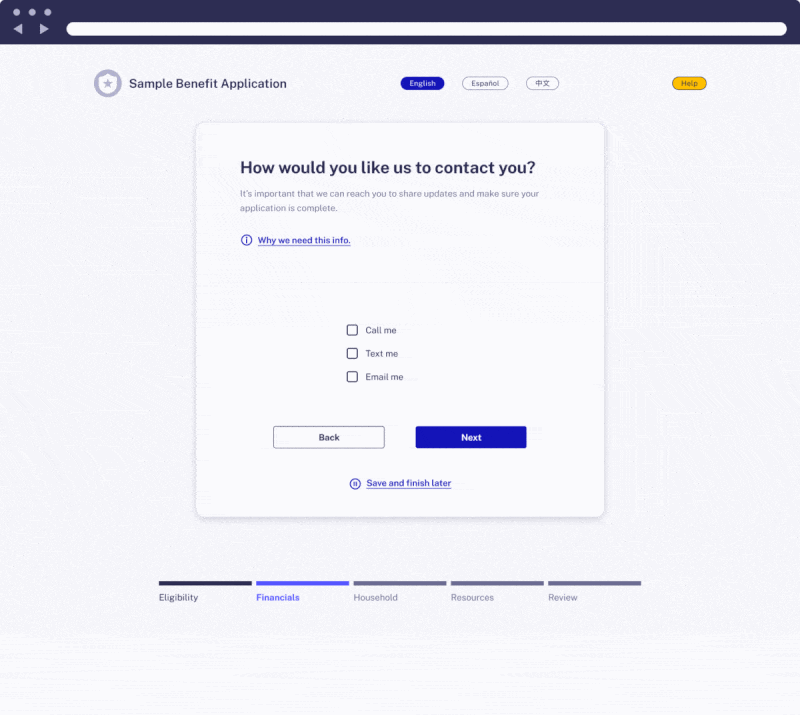
Keyboard nav
Accessibility
Applications created with the form builder tool are navigable via a keyboard, with clear focused and selected states.
Content is ordered to prioritize critical and new information sequentially, while demoting secondary or redundant actions.

Applications,
WCAG 2.1 -ified
Compliant by default
By controlling the accepted inputs and formatting of the resulting output, the Form Builder tool ensures applications adhere to WCAG 2.1 guidelines.
High contrast, dynamic text settings, ARIA landmarks, and available translations are just a few of the baked-in accessibility features.
Take a look around
Feel free to poke around the working Figma file below to view additional features and work-in-progress.
Next steps
1
Prototyping the bare bones
Finalize an interactive demo that service providers can respond to.
2
Co-designing a functioning tool
Working with public servants to adapt the tool to their needs and resources.
3
Form auditor + applicant portal
Integrate supplemental tools and features that will further support applicant success.